Accessibility for a record-breaking online voting
Ensuring digital inclusion and standardized accessibility

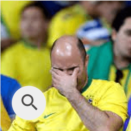
Quão animado(a) você está para a Copa do Mundo?
Muito animado(a)

Neutro(a)

Desanimado(a)


Overview
Role
UX Designer
Involved team
1 PO + 2 DEVs
Duration
4 months
Jul 2022 - Oct 2022
Tools
Figma, Notion and Maze
Context
Problem
A votação existente dependia de elementos que não funcionavam com leitores de tela, e a arquitetura da informação não era fluida para navegação por teclado. Era essencial garantir que todos os usuários pudessem participar de forma independente, rápida e eficiente.
The voting experiences are essential for engaging the audience and gathering feedback across entertainment programs, reality shows, and interactive campaigns at Globo. It was crucial to ensure that all users could participate independently, quickly, and efficiently.
Problem
Until then, there were no accessibility-focused initiatives in the voting experience, and it became necessary to restructure both the experience and the code to ensure that all users could participate quickly, efficiently, and inclusively.
Problem
Process
Study and Analysis
Ideation
Unmoderated test
Final solution
Results
Learnings and Impact
Study and Analysis
Because I initially had only a superficial understanding of accessibility, I had to dive deeply into the topic as the project progressed.
✅ 160 hours of study
Classes, readings, screen reader testing, and hands-on analysis of references.
🌟 Talks with other teams
To understand practices used in company projects and review internal guidelines.
⚡ Internal presentation
To present the topic, share foundational knowledge, and align objectives with the team.
This dedication turned me into a point of reference, providing the theoretical foundation, perspective to support the team, and the ability to identify improvement opportunities:
Rebuild the HTML code: many elements prevented screen readers from understanding the content.
Review the information architecture: navigation was not fluid when using screen readers and keyboard navigation.
Ideation
I redesigned the information architecture and user flow with accessibility at the core, without compromising simplicity or efficiency, guided by two main steps:
Low fidelity and Critique
I mapped the core elements of the voting flow and facilitated a critique session to expand the solution space, resulting in a wide range of alternatives and interaction possibilities.
High fidelity and Prototyping
After evaluating the flow and IA variations, I enhanced readability with visual refinements and narrowed the exploration to the two strongest, most coherent solutions:
A. Separate screen for CAPTCHA
What I did:
After selecting an option, the user is taken to a screen that displays only the chosen option and the CAPTCHA.
Goal:
Reduce the amount of information on a single screen, making it clearer what was selected and what the next step is (completing the CAPTCHA).
Point of attention:
Users might feel friction due to having to navigate to another screen to change their selection, which could impact the speed of the interaction.
Que nota você dá para o bolo de cenoura da Ana Maria?
A dancinha mais querida vai ser ensinada no Jornal Nacional

Ruim
Normal
Mudar opção
Resolva o captcha para confirmar seu voto na opção:
Delicioso

Publicidade
Ver Resultado Parcial

Publicidade
Que nota você dá para o bolo de cenoura da Ana Maria?
A dancinha mais querida vai ser ensinada no Jornal Nacional
Delicioso
Gostoso
Normal
Você selecionou a nota 5. Confirme que você é humano através do captcha para validar seu voto.
2
Ver Resultado Parcial
Publicidade
Que nota você dá para o bolo de cenoura da Ana Maria?
A dancinha mais querida vai ser ensinada no Jornal Nacional
Delicioso
Normal
Ruim
Você selecionou a opção Delicioso. Confirme que você é humano através do captcha para validar seu voto.
Publicidade
Ver Resultado Parcial
Publicidade
Que nota você dá para o bolo de cenoura da Ana Maria?
A dancinha mais querida vai ser ensinada no Jornal Nacional
Delicioso
Normal
Ruim
Você selecionou a nota 5. Confirme que você é humano através do captcha para validar seu voto.
2
Ver Resultado Parcial
Publicidade
B. Scroll to the CAPTCHA on the same screen
What I did:
After an option is selected, the screen automatically scrolls to reveal the chosen option and the CAPTCHA, keeping the selected option highlighted at the top using the editorial color.
Goal:
Remove the CAPTCHA from within the selected option while preserving the user’s context and awareness of their choice.
Point of attention:
There may be discomfort with the automatic scrolling behavior, or a risk that users forget which option they selected if they do not read the supporting text.
Both alternatives balanced accessibility and speed, so the final decision was made through an unmoderated test.
Low fidelity and Critique
I mapped the core elements of the voting flow and facilitated a critique session to expand the solution space, resulting in a wide range of alternatives and interaction possibilities.
Low fidelity and Critique
I mapped the core elements of the voting flow and facilitated a critique session to expand the solution space, resulting in a wide range of alternatives and interaction possibilities.
A. Separate screen for CAPTCHA
What I did:
After selecting an option, the user is taken to a screen that displays only the chosen option and the CAPTCHA.
Goal:
Reduce the amount of information on a single screen, making it clearer what was selected and what the next step is (completing the CAPTCHA).
Point of attention:
Users might feel friction due to having to navigate to another screen to change their selection, which could impact the speed of the interaction.
B. Scroll to the CAPTCHA on the same screen
What I did:
After an option is selected, the screen automatically scrolls to reveal the chosen option and the CAPTCHA, keeping the selected option highlighted at the top using the editorial color.
Goal:
Remove the CAPTCHA from within the selected option while preserving the user’s context and awareness of their choice.
Point of attention:
There may be discomfort with the automatic scrolling behavior, or a risk that users forget which option they selected if they do not read the supporting text.
Que nota você dá para o bolo de cenoura da Ana Maria?
A dancinha mais querida vai ser ensinada no Jornal Nacional
Ruim
Normal
Mudar opção
Resolva o captcha para confirmar seu voto na opção:
Delicioso
Publicidade
Ver Resultado Parcial
Publicidade
Que nota você dá para o bolo de cenoura da Ana Maria?
A dancinha mais querida vai ser ensinada no Jornal Nacional
Delicioso
Gostoso
Normal
Você selecionou a nota 5. Confirme que você é humano através do captcha para validar seu voto.
2
Ver Resultado Parcial
Publicidade
Que nota você dá para o bolo de cenoura da Ana Maria?
A dancinha mais querida vai ser ensinada no Jornal Nacional
Delicioso
Normal
Ruim
Você selecionou a opção Delicioso. Confirme que você é humano através do captcha para validar seu voto.
Publicidade
Ver Resultado Parcial
Publicidade
Que nota você dá para o bolo de cenoura da Ana Maria?
A dancinha mais querida vai ser ensinada no Jornal Nacional
Delicioso
Normal
Ruim
Você selecionou a nota 5. Confirme que você é humano através do captcha para validar seu voto.
2
Ver Resultado Parcial
Publicidade
Unmoderated test
Goal: Understand which information architecture and voting flow were more intuitive and faster.
Method: Unmoderated test on Maze.
Metrics: Completion time, completion rate, ratings, and qualitative comments.
Key results:
The changes reinforced practicality and speed while maintaining familiarity for users.
None of the identified ideation risks materialized.
The version closest to the previous experience was preferred, with slightly better quantitative performance.
As it was not possible to test the new proposals with screen reader users, I placed even greater emphasis on accessibility documentation and technical implementation.
Goal: Understand which information architecture and voting flow were more intuitive and faster.
Method: Unmoderated test on Maze.
Metrics: Completion time, completion rate, ratings, and qualitative comments.
Key results:
The changes reinforced practicality and speed while maintaining familiarity for users.
None of the identified ideation risks materialized.
The version closest to the previous experience was preferred, with slightly better quantitative performance.o familiaridade para os usuários.
As it was not possible to test the new proposals with screen reader users, I placed even greater emphasis on accessibility documentation and technical implementation.
Final solution

Quão animado(a) você está para a Copa do Mundo?
O evento acontece no mês de novembro no Qatar.
Muito animado(a)

Neutro(a)

Desanimado(a)
Quão animado(a) você está para a Copa do Mundo?
O evento acontece no mês de novembro no Qatar.
Muito animado(a)

Neutro(a)

Desanimado(a)

Você selecionou a opção Muito animado(a). Confirme que você é humano através do captcha para validar seu voto.

Quão animado(a) você está para a Copa do Mundo?
O evento acontece no mês de novembro no Qatar.
Muito animado(a)

Neutro(a)

Desanimado(a)

Você selecionou a opção Muito animado(a). Confirme que você é humano através do captcha para validar seu voto.
Processando seu voto
Você votou em
Muito animado(a)
Votar Novamente


automático
💡 Key visual changes
Changes
Impact
Use of the editorial color to highlight the selected option
Quickly highlights the selected option and ensures it is contextualized and accessible by default.
Removal of hCaptcha from within the option
Separates selection from validation, reducing cognitive load and increasing clarity.
Automatic scroll to the hCaptcha
Directs attention to the next step, making the flow more intuitive.
Feedback indicating the selected option and the next step
Confirms the user’s action and guides them forward, reducing errors and increasing confidence.
Que nota você dá para o bolo de cenoura da Ana Maria?
A dancinha mais querida vai ser ensinada no Jornal Nacional
Delicioso
Normal
Ruim
Você selecionou a opção Delicioso. Confirme que você é humano através do captcha para validar seu voto.
Ver Resultado Parcial
Publicidade
Que nota você dá para o bolo de cenoura da Ana Maria?
A dancinha mais querida vai ser ensinada no Jornal Nacional
Delicioso
Normal
Ruim
Você selecionou a nota 5. Confirme que você é humano através do captcha para validar seu voto.
2
Ver Resultado Parcial
Publicidade
Que nota você dá para o bolo de cenoura da Ana Maria?
A dancinha mais querida vai ser ensinada no Jornal Nacional
Delicioso
Normal
Ruim
Ver Resultado Parcial
Publicidade
scroll automático
Before
After
Que nota você dá para o bolo de cenoura da Ana Maria?
A dancinha mais querida vai ser ensinada no Jornal Nacional
Delicioso
Publicidade
Normal
Ruim
Ver Resultado Parcial
Publicidade
Que nota você dá para o bolo de cenoura da Ana Maria?
A dancinha mais querida vai ser ensinada no Jornal Nacional
Delicioso
Normal
Ruim
Você selecionou a opção Delicioso. Confirme que você é humano através do captcha para validar seu voto.
Publicidade
Ver Resultado Parcial
Publicidade
Que nota você dá para o bolo de cenoura da Ana Maria?
A dancinha mais querida vai ser ensinada no Jornal Nacional
Delicioso
Normal
Ruim
Você selecionou a nota 5. Confirme que você é humano através do captcha para validar seu voto.
2
Ver Resultado Parcial
Publicidade
scroll automático
💡 Key acessibility improvements
Improvements
Impact
Skip to page title option
Allows users to jump directly to the main content instead of getting stuck in the navigation menu.
Automatic and continuous announcement of user actions (e.g., “You voted for Very excited!”)
Provides immediate confirmation, reduces errors, and improves the experience for screen reader users.
Proper semantic definition of elements (buttons, text hierarchy, etc.)
Ensures the flow is accessible, intuitive, and consistent.
Empty alt attributes for decorative images
Screen readers ignore non-essential elements, simplifying navigation.
Video of the complete new flow:
Video and screen reader audio:
Entendendo a Documentação de Acessibilidade
Estrutura
A documentação de acessibilidade costuma ser feita principalmente a partir dos elementos de uma página, seja ele puro ou com outros elementos.
Esse documento não é focado em nenhuma linguagem de programação, ela é feita sobre o ponto de vista do design, dos conhecimentos em leitores de tela (LT) e posteriormente é aplicada na linguagem do projeto a partir dos conhecimentos do desenvolvedor também.
Os pontos aqui podem e devem ser revistos caso algo não pareça fazer sentido e devemos testar algumas coisas em QA para comprovar nossas ideias.
Alguns dos pontos da documentação contém o número e link do critério da WCAG que estamos abordando no elemento. Dentro dos critérios no site da W3 vocês encontram a explicação, exemplos de uso e algumas técnicas para aplicar no código o que está sendo proposto.
Regras gerais
Nosso site deve estar no idioma Português BR, determinado pelo no html. (Critério 3.1.1)
Vamos inserir um link invisível que possibilita o usuário pular para o conteúdo principal
O foco visível deve estar ativado mesmo que sem personalização. (Critério 2.4.7)
Nossa navegação acontece sempre da esquerda para a direita, de cima para baixo. Apenas a imagem da votação tem uma ordem ”diferente”. (Critério 2.4.3)
Informações que tem textos fixos são representados com preto na literal e informações com variáveis (ou seja, mudam de acordo com o texto do botão ou tela) são representados com roxo: “Votação {título da votação}”
Mais critérios importantes
Critério 1.3.1 - Informações e Relações
Critério 2.1.1 - Teclado
Critério 2.1.2 - Sem bloqueio de teclado
Critério 2.4.6 - Cabeçalhos e Rótulos
Critério 4.1.1 - Análise (código)
Critério 4.1.2 - Nome, Função e Valor
Dúvidas
Qualquer dúvida podem entrar em contato no slack ou deixar comentários no figma que respondo e atuamos nas telas
Você votou na nota
5
Votar Novamente
Ver Resultado Parcial

5

Menu
GloboNews
Buscar
ESTÚDIO I
1
2
3
4
2.1
2.2
Você votou na nota
5
Votar Novamente
Ver Resultado Parcial

Documentação Voto Confirmado
1 - Deve ser agrupado e identificado como Texto de Nível 1 e sua literal deve ser “Você votou na nota {nota votada}” e o ícone de confirmação não deve ser lido pelo leitor de tela
2 - Compartilhamento (Critério - 4.1.2)
2.1 - Deve ser identificado como [Botão] e sua literal deve ser "Compartilhar seu voto no Facebook”
2.2 - Deve ser identificado como [Botão] e sua literal deve ser "Compartilhar seu voto no Twitter”
Tentar incluir idioma das partes para o nome dos aplicativos (Critério 3.1.2)
3 - Deve ser identificado como [Botão] e sua literal deve ser ”Votar novamente {título da votação}”
4 - Deve ser identificado como Botão e sua literal deve ser ”Ver Resultado Parcial {título da votação}”
5 - Informe Publicitário
6 - Válido apenas para o mobile - Deve ser identificado como [Botão] e sua literal deve ser "Compartilhar seu voto”
6
Example of accessibility documentation:
👉 Why accessibility documentation was important:
It served as the foundation for implementing the new HTML, supported the validation of all elements with screen readers, and enabled collaborative reviews with the team.
👉 Why accessibility documentation was important:
It served as the foundation for implementing the new HTML, supported the validation of all elements with screen readers, and enabled collaborative reviews with the team.
Results + Test
We measured the results through a usability test with five blind participants conducted by Globo’s UX Research Lab.
✅ Successes
100% of participants completed the identification and voting option selection flow without difficulty.
Positive feedback on the clarity and speed of the new flow when using screen readers.
⚠️ Areas for improvement
The results page and features outside the team’s scope showed inconsistencies at the time, making it difficult for some users to autonomously complete the entire flow.
Learnings and Impact
📝 Key learnings
Accessibility needs to be considered from the very beginning of a project.
Testing with screen readers and putting myself in the user’s place was essential.
Sharing knowledge strengthens team culture and creates impact beyond the project.
✨ Impact beyond the project
I became a reference for accessibility within my management team.
I supported other designers in applying accessibility best practices.
I helped structure and strengthen an accessibility-driven culture within my team.


See more projects
Let's turn challenges into solutions.
Process
Study and Analysis
Ideation
Unmoderated test
Final solution
Results
Learning and Impact
Process
Study and Analysis
Ideation
Unmoderated test
Final solution
Results
Learning and Impact
Accessibility for a record-breaking online voting
Ensuring digital inclusion and standardized accessibility
Quão animado(a) você está para a Copa do Mundo?
Muito animado(a)
Neutro(a)
Desanimado(a)
Overview
Role
UX Designer
Involved team
1 PO + 2 DEVs
Duration
4 months
Jul 2022 - Oct 2022
Tools
Figma, Notion e Maze
Context
Problem
A votação existente dependia de elementos que não funcionavam com leitores de tela, e a arquitetura da informação não era fluida para navegação por teclado. Era essencial garantir que todos os usuários pudessem participar de forma independente, rápida e eficiente.
The voting experiences are essential for engaging the audience and gathering feedback across entertainment programs, reality shows, and interactive campaigns at Globo. It was crucial to ensure that all users could participate independently, quickly, and efficiently.
Problem
Until then, there were no accessibility-focused initiatives in the voting experience, and it became necessary to restructure both the experience and the code to ensure that all users could participate quickly, efficiently, and inclusively.
Problem
Process
Study and Analysis
Ideation
Unmoderated test
Final solution
Results
Learnings and Impact
Study and Analysis
Because I initially had only a superficial understanding of accessibility, I had to dive deeply into the topic as the project progressed.
✅ 160 hours of study
Classes, readings, screen reader testing, and hands-on analysis of references.
🌟 Talks with other teams
To understand practices used in company projects and review internal guidelines.
⚡ Internal presentation
To present the topic, share foundational knowledge, and align objectives with the team.
This dedication turned me into a point of reference, providing the theoretical foundation, perspective to support the team, and the ability to identify improvement opportunities:
Rebuild the HTML code: many elements prevented screen readers from understanding the content.
Review the information architecture: navigation was not fluid when using screen readers and keyboard navigation.
Rebuild the HTML code: many elements prevented screen readers from understanding the content.
Review the information architecture: navigation was not fluid when using screen readers and keyboard navigation.
Ideation
I redesigned the information architecture and user flow with accessibility at the core, without compromising simplicity or efficiency, guided by two main steps:
Low fidelity and Critique
I mapped the core elements of the voting flow and facilitated a critique session to expand the solution space, resulting in a wide range of alternatives and interaction possibilities.
High fidelity and Prototyping
After evaluating the flow and IA variations, I enhanced readability with visual refinements and narrowed the exploration to the two strongest, most coherent solutions:
A. Separate screen for CAPTCHA
What I did:
After selecting an option, the user is taken to a screen that displays only the chosen option and the CAPTCHA.
Goal:
Reduce the amount of information on a single screen, making it clearer what was selected and what the next step is (completing the CAPTCHA).
Point of attention:
Users might feel friction due to having to navigate to another screen to change their selection, which could impact the speed of the interaction.
Que nota você dá para o bolo de cenoura da Ana Maria?
A dancinha mais querida vai ser ensinada no Jornal Nacional
Ruim
Normal
Mudar opção
Resolva o captcha para confirmar seu voto na opção:
Delicioso
Publicidade
Ver Resultado Parcial
Publicidade
Que nota você dá para o bolo de cenoura da Ana Maria?
A dancinha mais querida vai ser ensinada no Jornal Nacional
Delicioso
Gostoso
Normal
Você selecionou a nota 5. Confirme que você é humano através do captcha para validar seu voto.
2
Ver Resultado Parcial
Publicidade
Que nota você dá para o bolo de cenoura da Ana Maria?
A dancinha mais querida vai ser ensinada no Jornal Nacional
Delicioso
Normal
Ruim
Você selecionou a opção Delicioso. Confirme que você é humano através do captcha para validar seu voto.
Publicidade
Ver Resultado Parcial
Publicidade
Que nota você dá para o bolo de cenoura da Ana Maria?
A dancinha mais querida vai ser ensinada no Jornal Nacional
Delicioso
Normal
Ruim
Você selecionou a nota 5. Confirme que você é humano através do captcha para validar seu voto.
2
Ver Resultado Parcial
Publicidade
B. Scroll to the CAPTCHA on the same screen
What I did:
After an option is selected, the screen automatically scrolls to reveal the chosen option and the CAPTCHA, keeping the selected option highlighted at the top using the editorial color.
Goal:
Remove the CAPTCHA from within the selected option while preserving the user’s context and awareness of their choice.
Point of attention:
There may be discomfort with the automatic scrolling behavior, or a risk that users forget which option they selected if they do not read the supporting text.
Both alternatives balanced accessibility and speed, so the final decision was made through an unmoderated test.
Low fidelity and Critique
I mapped the core elements of the voting flow and facilitated a critique session to expand the solution space, resulting in a wide range of alternatives and interaction possibilities.
Low fidelity and Critique
I mapped the core elements of the voting flow and facilitated a critique session to expand the solution space, resulting in a wide range of alternatives and interaction possibilities.
A. Separate screen for CAPTCHA
What I did:
After selecting an option, the user is taken to a screen that displays only the chosen option and the CAPTCHA.
Goal:
Reduce the amount of information on a single screen, making it clearer what was selected and what the next step is (completing the CAPTCHA).
Point of attention:
Users might feel friction due to having to navigate to another screen to change their selection, which could impact the speed of the interaction.
B. Scroll to the CAPTCHA on the same screen
What I did:
After an option is selected, the screen automatically scrolls to reveal the chosen option and the CAPTCHA, keeping the selected option highlighted at the top using the editorial color.
Goal:
Remove the CAPTCHA from within the selected option while preserving the user’s context and awareness of their choice.
Point of attention:
There may be discomfort with the automatic scrolling behavior, or a risk that users forget which option they selected if they do not read the supporting text.
Que nota você dá para o bolo de cenoura da Ana Maria?
A dancinha mais querida vai ser ensinada no Jornal Nacional
Ruim
Normal
Mudar opção
Resolva o captcha para confirmar seu voto na opção:
Delicioso
Publicidade
Ver Resultado Parcial
Publicidade
Que nota você dá para o bolo de cenoura da Ana Maria?
A dancinha mais querida vai ser ensinada no Jornal Nacional
Delicioso
Gostoso
Normal
Você selecionou a nota 5. Confirme que você é humano através do captcha para validar seu voto.
2
Ver Resultado Parcial
Publicidade
Que nota você dá para o bolo de cenoura da Ana Maria?
A dancinha mais querida vai ser ensinada no Jornal Nacional
Delicioso
Normal
Ruim
Você selecionou a opção Delicioso. Confirme que você é humano através do captcha para validar seu voto.
Publicidade
Ver Resultado Parcial
Publicidade
Que nota você dá para o bolo de cenoura da Ana Maria?
A dancinha mais querida vai ser ensinada no Jornal Nacional
Delicioso
Normal
Ruim
Você selecionou a nota 5. Confirme que você é humano através do captcha para validar seu voto.
2
Ver Resultado Parcial
Publicidade
A. Separate screen for CAPTCHA
What I did:
After selecting an option, the user is taken to a screen that displays only the chosen option and the CAPTCHA.
Goal:
Reduce the amount of information on a single screen, making it clearer what was selected and what the next step is (completing the CAPTCHA).
Point of attention:
Users might feel friction due to having to navigate to another screen to change their selection, which could impact the speed of the interaction.
B. Scroll to the CAPTCHA on the same screen
What I did:
After an option is selected, the screen automatically scrolls to reveal the chosen option and the CAPTCHA, keeping the selected option highlighted at the top using the editorial color.
Goal:
Remove the CAPTCHA from within the selected option while preserving the user’s context and awareness of their choice.
Point of attention:
There may be discomfort with the automatic scrolling behavior, or a risk that users forget which option they selected if they do not read the supporting text.
Que nota você dá para o bolo de cenoura da Ana Maria?
A dancinha mais querida vai ser ensinada no Jornal Nacional
Ruim
Normal
Mudar opção
Resolva o captcha para confirmar seu voto na opção:
Delicioso
Publicidade
Ver Resultado Parcial
Publicidade
Que nota você dá para o bolo de cenoura da Ana Maria?
A dancinha mais querida vai ser ensinada no Jornal Nacional
Delicioso
Gostoso
Normal
Você selecionou a nota 5. Confirme que você é humano através do captcha para validar seu voto.
2
Ver Resultado Parcial
Publicidade
Que nota você dá para o bolo de cenoura da Ana Maria?
A dancinha mais querida vai ser ensinada no Jornal Nacional
Delicioso
Normal
Ruim
Você selecionou a opção Delicioso. Confirme que você é humano através do captcha para validar seu voto.
Publicidade
Ver Resultado Parcial
Publicidade
Que nota você dá para o bolo de cenoura da Ana Maria?
A dancinha mais querida vai ser ensinada no Jornal Nacional
Delicioso
Normal
Ruim
Você selecionou a nota 5. Confirme que você é humano através do captcha para validar seu voto.
2
Ver Resultado Parcial
Publicidade
Unmoderated test
Goal: Understand which information architecture and voting flow were more intuitive and faster.
Method: Unmoderated test on Maze.
Metrics: Completion time, completion rate, ratings, and qualitative comments.
Key results:
The changes reinforced practicality and speed while maintaining familiarity for users.
None of the identified ideation risks materialized.
The version closest to the previous experience was preferred, with slightly better quantitative performance.
As it was not possible to test the new proposals with screen reader users, I placed even greater emphasis on accessibility documentation and technical implementation.
Goal: Understand which information architecture and voting flow were more intuitive and faster.
Method: Unmoderated test on Maze.
Metrics: Completion time, completion rate, ratings, and qualitative comments.
Key results:
The changes reinforced practicality and speed while maintaining familiarity for users.
None of the identified ideation risks materialized.
The version closest to the previous experience was preferred, with slightly better quantitative performance.
As it was not possible to test the new proposals with screen reader users, I placed even greater emphasis on accessibility documentation and technical implementation.
Goal: Understand which information architecture and voting flow were more intuitive and faster.
Method: Unmoderated test on Maze.
Metrics: Completion time, completion rate, ratings, and qualitative comments.
Key results:
The changes reinforced practicality and speed while maintaining familiarity for users.
None of the identified ideation risks materialized.
The version closest to the previous experience was preferred, with slightly better quantitative performance.o familiaridade para os usuários.
As it was not possible to test the new proposals with screen reader users, I placed even greater emphasis on accessibility documentation and technical implementation.
Final solution
Quão animado(a) você está para a Copa do Mundo?
O evento acontece no mês de novembro no Qatar.
Muito animado(a)
Neutro(a)
Desanimado(a)
Quão animado(a) você está para a Copa do Mundo?
O evento acontece no mês de novembro no Qatar.
Muito animado(a)
Neutro(a)
Desanimado(a)
Você selecionou a opção Muito animado(a). Confirme que você é humano através do captcha para validar seu voto.
Quão animado(a) você está para a Copa do Mundo?
O evento acontece no mês de novembro no Qatar.
Muito animado(a)
Neutro(a)
Desanimado(a)
Você selecionou a opção Muito animado(a). Confirme que você é humano através do captcha para validar seu voto.
Processando seu voto
Você votou em
Muito animado(a)
Votar Novamente
automático
💡 Key visual changes
Changes
Impact
Use of the editorial color to highlight the selected option
Quickly highlights the selected option and ensures it is contextualized and accessible by default.
Remoção do captcha de
dentro da opção
Separates selection from validation, reducing cognitive load and increasing clarity.
Automatic scroll to the hCaptcha
Directs attention to the next step, making the flow more intuitive.
Feedback indicating the selected option and the next step
Confirms the user’s action and guides them forward, reducing errors and increasing confidence.
Que nota você dá para o bolo de cenoura da Ana Maria?
A dancinha mais querida vai ser ensinada no Jornal Nacional
Delicioso
Normal
Ruim
Você selecionou a opção Delicioso. Confirme que você é humano através do captcha para validar seu voto.
Ver Resultado Parcial
Publicidade
Que nota você dá para o bolo de cenoura da Ana Maria?
A dancinha mais querida vai ser ensinada no Jornal Nacional
Delicioso
Normal
Ruim
Você selecionou a nota 5. Confirme que você é humano através do captcha para validar seu voto.
2
Ver Resultado Parcial
Publicidade
Que nota você dá para o bolo de cenoura da Ana Maria?
A dancinha mais querida vai ser ensinada no Jornal Nacional
Delicioso
Normal
Ruim
Ver Resultado Parcial
Publicidade
scroll automático
Before
After
Que nota você dá para o bolo de cenoura da Ana Maria?
A dancinha mais querida vai ser ensinada no Jornal Nacional
Delicioso
Publicidade
Normal
Ruim
Ver Resultado Parcial
Publicidade
Que nota você dá para o bolo de cenoura da Ana Maria?
A dancinha mais querida vai ser ensinada no Jornal Nacional
Delicioso
Normal
Ruim
Você selecionou a opção Delicioso. Confirme que você é humano através do captcha para validar seu voto.
Publicidade
Ver Resultado Parcial
Publicidade
Que nota você dá para o bolo de cenoura da Ana Maria?
A dancinha mais querida vai ser ensinada no Jornal Nacional
Delicioso
Normal
Ruim
Você selecionou a nota 5. Confirme que você é humano através do captcha para validar seu voto.
2
Ver Resultado Parcial
Publicidade
scroll automático
💡 Key acessibility improvements
Improvements
Impact
Skip to page title option
Allows users to jump directly to the main content instead of getting stuck in the navigation menu.
Automatic and continuous announcement of user actions (e.g., “You voted for Very excited!”)
Provides immediate confirmation, reduces errors, and improves the experience for screen reader users.
Proper semantic definition of elements (buttons, text hierarchy, etc.)
Ensures the flow is accessible, intuitive, and consistent.
Empty alt attributes for decorative images
Screen readers ignore non-essential elements, simplifying navigation.
Video of the complete new flow:
Video and screen reader audio:
Entendendo a Documentação de Acessibilidade
Estrutura
A documentação de acessibilidade costuma ser feita principalmente a partir dos elementos de uma página, seja ele puro ou com outros elementos.
Esse documento não é focado em nenhuma linguagem de programação, ela é feita sobre o ponto de vista do design, dos conhecimentos em leitores de tela (LT) e posteriormente é aplicada na linguagem do projeto a partir dos conhecimentos do desenvolvedor também.
Os pontos aqui podem e devem ser revistos caso algo não pareça fazer sentido e devemos testar algumas coisas em QA para comprovar nossas ideias.
Alguns dos pontos da documentação contém o número e link do critério da WCAG que estamos abordando no elemento. Dentro dos critérios no site da W3 vocês encontram a explicação, exemplos de uso e algumas técnicas para aplicar no código o que está sendo proposto.
Regras gerais
Nosso site deve estar no idioma Português BR, determinado pelo no html. (Critério 3.1.1)
Vamos inserir um link invisível que possibilita o usuário pular para o conteúdo principal
O foco visível deve estar ativado mesmo que sem personalização. (Critério 2.4.7)
Nossa navegação acontece sempre da esquerda para a direita, de cima para baixo. Apenas a imagem da votação tem uma ordem ”diferente”. (Critério 2.4.3)
Informações que tem textos fixos são representados com preto na literal e informações com variáveis (ou seja, mudam de acordo com o texto do botão ou tela) são representados com roxo: “Votação {título da votação}”
Mais critérios importantes
Critério 1.3.1 - Informações e Relações
Critério 2.1.1 - Teclado
Critério 2.1.2 - Sem bloqueio de teclado
Critério 2.4.6 - Cabeçalhos e Rótulos
Critério 4.1.1 - Análise (código)
Critério 4.1.2 - Nome, Função e Valor
Dúvidas
Qualquer dúvida podem entrar em contato no slack ou deixar comentários no figma que respondo e atuamos nas telas
Você votou na nota
5
Votar Novamente
Ver Resultado Parcial
5
Menu
GloboNews
Buscar
ESTÚDIO I
1
2
3
4
2.1
2.2
Você votou na nota
5
Votar Novamente
Ver Resultado Parcial
Documentação Voto Confirmado
1 - Deve ser agrupado e identificado como Texto de Nível 1 e sua literal deve ser “Você votou na nota {nota votada}” e o ícone de confirmação não deve ser lido pelo leitor de tela
2 - Compartilhamento (Critério - 4.1.2)
2.1 - Deve ser identificado como [Botão] e sua literal deve ser "Compartilhar seu voto no Facebook”
2.2 - Deve ser identificado como [Botão] e sua literal deve ser "Compartilhar seu voto no Twitter”
Tentar incluir idioma das partes para o nome dos aplicativos (Critério 3.1.2)
3 - Deve ser identificado como [Botão] e sua literal deve ser ”Votar novamente {título da votação}”
4 - Deve ser identificado como Botão e sua literal deve ser ”Ver Resultado Parcial {título da votação}”
5 - Informe Publicitário
6 - Válido apenas para o mobile - Deve ser identificado como [Botão] e sua literal deve ser "Compartilhar seu voto”
6
Example of accessibility documentation:
👉 Why accessibility documentation was important:
It served as the foundation for implementing the new HTML, supported the validation of all elements with screen readers, and enabled collaborative reviews with the team.
👉 Why accessibility documentation was important:
It served as the foundation for implementing the new HTML, supported the validation of all elements with screen readers, and enabled collaborative reviews with the team.
Results + Test
We measured the results through a usability test with five blind participants conducted by Globo’s UX Research Lab.
✅ Successes
100% of participants completed the identification and voting option selection flow without difficulty.
Positive feedback on the clarity and speed of the new flow when using screen readers.
⚠️ Areas for improvement
The results page and features outside the team’s scope showed inconsistencies at the time, making it difficult for some users to autonomously complete the entire flow.
Learnings and Impact
📝 Key learnings
Accessibility needs to be considered from the very beginning of a project.
Testing with screen readers and putting myself in the user’s place was essential.
Sharing knowledge strengthens team culture and creates impact beyond the project.
✨ Impact beyond the project
I became a reference for accessibility within my management team.
I supported other designers in applying accessibility best practices.
I helped structure and strengthen an accessibility-driven culture within my team.
See more projects
Let's turn challenges into solutions.
Process
Study and Analysis
Ideation
Unmoderated test
Final solution
Results
Learning and Impact
Process
Study and Analysis
Ideation
Unmoderated test
Final solution
Results
Learning and Impact
Accessibility for a record-breaking online voting
Ensuring digital inclusion and standardized accessibility
Quão animado(a) você está para a Copa do Mundo?
Muito animado(a)
Neutro(a)
Desanimado(a)
Overview
Role
UX Designer
Involved team
1 PO + 2 DEVs
Duration
4 months
Jul 2022 - Oct 2022
Tools
Figma, Notion and Maze
Context
Problem
A votação existente dependia de elementos que não funcionavam com leitores de tela, e a arquitetura da informação não era fluida para navegação por teclado. Era essencial garantir que todos os usuários pudessem participar de forma independente, rápida e eficiente.
The voting experiences are essential for engaging the audience and gathering feedback across entertainment programs, reality shows, and interactive campaigns at Globo. It was crucial to ensure that all users could participate independently, quickly, and efficiently.
Problem
Until then, there were no accessibility-focused initiatives in the voting experience, and it became necessary to restructure both the experience and the code to ensure that all users could participate quickly, efficiently, and inclusively.
Problem
Process
Study and Analysis
Ideation
Unmoderated test
Final solution
Results
Learnings and Impact
Study and Analysis
Because I initially had only a superficial understanding of accessibility, I had to dive deeply into the topic as the project progressed.
✅ 160 hours of study
Classes, readings, screen reader testing, and hands-on analysis of references.
🌟 Talks with other teams
To understand practices used in company projects and review internal guidelines.
⚡ Internal presentation
To present the topic, share foundational knowledge, and align objectives with the team.
This dedication turned me into a point of reference, providing the theoretical foundation, perspective to support the team, and the ability to identify improvement opportunities:
Rebuild the HTML code: many elements prevented screen readers from understanding the content.
Review the information architecture: navigation was not fluid when using screen readers and keyboard navigation.
Rebuild the HTML code: many elements prevented screen readers from understanding the content.
Review the information architecture: navigation was not fluid when using screen readers and keyboard navigation.
Ideation
I redesigned the information architecture and user flow with accessibility at the core, without compromising simplicity or efficiency, guided by two main steps:
Low fidelity and Critique
I mapped the core elements of the voting flow and facilitated a critique session to expand the solution space, resulting in a wide range of alternatives and interaction possibilities.
High fidelity and Prototyping
After evaluating the flow and IA variations, I enhanced readability with visual refinements and narrowed the exploration to the two strongest, most coherent solutions:
A. Separate screen for CAPTCHA
What I did:
After selecting an option, the user is taken to a screen that displays only the chosen option and the CAPTCHA.
Goal:
Reduce the amount of information on a single screen, making it clearer what was selected and what the next step is (completing the CAPTCHA).
Point of attention:
Users might feel friction due to having to navigate to another screen to change their selection, which could impact the speed of the interaction.
Que nota você dá para o bolo de cenoura da Ana Maria?
A dancinha mais querida vai ser ensinada no Jornal Nacional
Ruim
Normal
Mudar opção
Resolva o captcha para confirmar seu voto na opção:
Delicioso
Publicidade
Ver Resultado Parcial
Publicidade
Que nota você dá para o bolo de cenoura da Ana Maria?
A dancinha mais querida vai ser ensinada no Jornal Nacional
Delicioso
Gostoso
Normal
Você selecionou a nota 5. Confirme que você é humano através do captcha para validar seu voto.
2
Ver Resultado Parcial
Publicidade
Que nota você dá para o bolo de cenoura da Ana Maria?
A dancinha mais querida vai ser ensinada no Jornal Nacional
Delicioso
Normal
Ruim
Você selecionou a opção Delicioso. Confirme que você é humano através do captcha para validar seu voto.
Publicidade
Ver Resultado Parcial
Publicidade
Que nota você dá para o bolo de cenoura da Ana Maria?
A dancinha mais querida vai ser ensinada no Jornal Nacional
Delicioso
Normal
Ruim
Você selecionou a nota 5. Confirme que você é humano através do captcha para validar seu voto.
2
Ver Resultado Parcial
Publicidade
B. Scroll to the CAPTCHA on the same screen
What I did:
After an option is selected, the screen automatically scrolls to reveal the chosen option and the CAPTCHA, keeping the selected option highlighted at the top using the editorial color.
Goal:
Remove the CAPTCHA from within the selected option while preserving the user’s context and awareness of their choice.
Point of attention:
There may be discomfort with the automatic scrolling behavior, or a risk that users forget which option they selected if they do not read the supporting text.
Both alternatives balanced accessibility and speed, so the final decision was made through an unmoderated test.
Low fidelity and Critique
I mapped the core elements of the voting flow and facilitated a critique session to expand the solution space, resulting in a wide range of alternatives and interaction possibilities.
Low fidelity and Critique
I mapped the core elements of the voting flow and facilitated a critique session to expand the solution space, resulting in a wide range of alternatives and interaction possibilities.
A. Separate screen for CAPTCHA
What I did:
After selecting an option, the user is taken to a screen that displays only the chosen option and the CAPTCHA.
Goal:
Reduce the amount of information on a single screen, making it clearer what was selected and what the next step is (completing the CAPTCHA).
Point of attention:
Users might feel friction due to having to navigate to another screen to change their selection, which could impact the speed of the interaction.
B. Scroll to the CAPTCHA on the same screen
What I did:
After an option is selected, the screen automatically scrolls to reveal the chosen option and the CAPTCHA, keeping the selected option highlighted at the top using the editorial color.
Goal:
Remove the CAPTCHA from within the selected option while preserving the user’s context and awareness of their choice.
Point of attention:
There may be discomfort with the automatic scrolling behavior, or a risk that users forget which option they selected if they do not read the supporting text.
Que nota você dá para o bolo de cenoura da Ana Maria?
A dancinha mais querida vai ser ensinada no Jornal Nacional
Ruim
Normal
Mudar opção
Resolva o captcha para confirmar seu voto na opção:
Delicioso
Publicidade
Ver Resultado Parcial
Publicidade
Que nota você dá para o bolo de cenoura da Ana Maria?
A dancinha mais querida vai ser ensinada no Jornal Nacional
Delicioso
Gostoso
Normal
Você selecionou a nota 5. Confirme que você é humano através do captcha para validar seu voto.
2
Ver Resultado Parcial
Publicidade
Que nota você dá para o bolo de cenoura da Ana Maria?
A dancinha mais querida vai ser ensinada no Jornal Nacional
Delicioso
Normal
Ruim
Você selecionou a opção Delicioso. Confirme que você é humano através do captcha para validar seu voto.
Publicidade
Ver Resultado Parcial
Publicidade
Que nota você dá para o bolo de cenoura da Ana Maria?
A dancinha mais querida vai ser ensinada no Jornal Nacional
Delicioso
Normal
Ruim
Você selecionou a nota 5. Confirme que você é humano através do captcha para validar seu voto.
2
Ver Resultado Parcial
Publicidade
A. Separate screen for CAPTCHA
What I did:
After selecting an option, the user is taken to a screen that displays only the chosen option and the CAPTCHA.
Goal:
Reduce the amount of information on a single screen, making it clearer what was selected and what the next step is (completing the CAPTCHA).
Point of attention:
Users might feel friction due to having to navigate to another screen to change their selection, which could impact the speed of the interaction.
B. Scroll to the CAPTCHA on the same screen
What I did:
After an option is selected, the screen automatically scrolls to reveal the chosen option and the CAPTCHA, keeping the selected option highlighted at the top using the editorial color.
Goal:
Remove the CAPTCHA from within the selected option while preserving the user’s context and awareness of their choice.
Point of attention:
There may be discomfort with the automatic scrolling behavior, or a risk that users forget which option they selected if they do not read the supporting text.
Que nota você dá para o bolo de cenoura da Ana Maria?
A dancinha mais querida vai ser ensinada no Jornal Nacional
Ruim
Normal
Mudar opção
Resolva o captcha para confirmar seu voto na opção:
Delicioso
Publicidade
Ver Resultado Parcial
Publicidade
Que nota você dá para o bolo de cenoura da Ana Maria?
A dancinha mais querida vai ser ensinada no Jornal Nacional
Delicioso
Gostoso
Normal
Você selecionou a nota 5. Confirme que você é humano através do captcha para validar seu voto.
2
Ver Resultado Parcial
Publicidade
Que nota você dá para o bolo de cenoura da Ana Maria?
A dancinha mais querida vai ser ensinada no Jornal Nacional
Delicioso
Normal
Ruim
Você selecionou a opção Delicioso. Confirme que você é humano através do captcha para validar seu voto.
Publicidade
Ver Resultado Parcial
Publicidade
Que nota você dá para o bolo de cenoura da Ana Maria?
A dancinha mais querida vai ser ensinada no Jornal Nacional
Delicioso
Normal
Ruim
Você selecionou a nota 5. Confirme que você é humano através do captcha para validar seu voto.
2
Ver Resultado Parcial
Publicidade
Unmoderated test
Goal: Understand which information architecture and voting flow were more intuitive and faster.
Method: Unmoderated test on Maze.
Metrics: Completion time, completion rate, ratings, and qualitative comments.
Key results:
The changes reinforced practicality and speed while maintaining familiarity for users.
None of the identified ideation risks materialized.
The version closest to the previous experience was preferred, with slightly better quantitative performance.
As it was not possible to test the new proposals with screen reader users, I placed even greater emphasis on accessibility documentation and technical implementation.
Goal: Understand which information architecture and voting flow were more intuitive and faster.
Method: Unmoderated test on Maze.
Metrics: Completion time, completion rate, ratings, and qualitative comments.
Key results:
The changes reinforced practicality and speed while maintaining familiarity for users.
None of the identified ideation risks materialized.
The version closest to the previous experience was preferred, with slightly better quantitative performance.
As it was not possible to test the new proposals with screen reader users, I placed even greater emphasis on accessibility documentation and technical implementation.
Goal: Understand which information architecture and voting flow were more intuitive and faster.
Method: Unmoderated test on Maze.
Metrics: Completion time, completion rate, ratings, and qualitative comments.
Key results:
The changes reinforced practicality and speed while maintaining familiarity for users.
None of the identified ideation risks materialized.
The version closest to the previous experience was preferred, with slightly better quantitative performance.o familiaridade para os usuários.
As it was not possible to test the new proposals with screen reader users, I placed even greater emphasis on accessibility documentation and technical implementation.
Final solution
Quão animado(a) você está para a Copa do Mundo?
O evento acontece no mês de novembro no Qatar.
Muito animado(a)
Neutro(a)
Desanimado(a)
Quão animado(a) você está para a Copa do Mundo?
O evento acontece no mês de novembro no Qatar.
Muito animado(a)
Neutro(a)
Desanimado(a)
Você selecionou a opção Muito animado(a). Confirme que você é humano através do captcha para validar seu voto.
Quão animado(a) você está para a Copa do Mundo?
O evento acontece no mês de novembro no Qatar.
Muito animado(a)
Neutro(a)
Desanimado(a)
Você selecionou a opção Muito animado(a). Confirme que você é humano através do captcha para validar seu voto.
Processando seu voto
Você votou em
Muito animado(a)
Votar Novamente
automático
💡 Key visual changes
Changes
Impact
Use of the editorial color to highlight the selected option
Quickly highlights the selected option and ensures it is contextualized and accessible by default.
Removal of hCaptcha from within the option
Separates selection from validation, reducing cognitive load and increasing clarity.
Automatic scroll to the hCaptcha
Directs attention to the next step, making the flow more intuitive.
Feedback indicating the selected option and the next step
Confirms the user’s action and guides them forward, reducing errors and increasing confidence.
Que nota você dá para o bolo de cenoura da Ana Maria?
A dancinha mais querida vai ser ensinada no Jornal Nacional
Delicioso
Normal
Ruim
Você selecionou a opção Delicioso. Confirme que você é humano através do captcha para validar seu voto.
Ver Resultado Parcial
Publicidade
Que nota você dá para o bolo de cenoura da Ana Maria?
A dancinha mais querida vai ser ensinada no Jornal Nacional
Delicioso
Normal
Ruim
Você selecionou a nota 5. Confirme que você é humano através do captcha para validar seu voto.
2
Ver Resultado Parcial
Publicidade
Que nota você dá para o bolo de cenoura da Ana Maria?
A dancinha mais querida vai ser ensinada no Jornal Nacional
Delicioso
Normal
Ruim
Ver Resultado Parcial
Publicidade
scroll automático
Before
After
Que nota você dá para o bolo de cenoura da Ana Maria?
A dancinha mais querida vai ser ensinada no Jornal Nacional
Delicioso
Publicidade
Normal
Ruim
Ver Resultado Parcial
Publicidade
Que nota você dá para o bolo de cenoura da Ana Maria?
A dancinha mais querida vai ser ensinada no Jornal Nacional
Delicioso
Normal
Ruim
Você selecionou a opção Delicioso. Confirme que você é humano através do captcha para validar seu voto.
Publicidade
Ver Resultado Parcial
Publicidade
Que nota você dá para o bolo de cenoura da Ana Maria?
A dancinha mais querida vai ser ensinada no Jornal Nacional
Delicioso
Normal
Ruim
Você selecionou a nota 5. Confirme que você é humano através do captcha para validar seu voto.
2
Ver Resultado Parcial
Publicidade
scroll automático
💡 Key acessibility improvements
Improvements
Impact
Skip to page title option
Allows users to jump directly to the main content instead of getting stuck in the navigation menu.
Automatic and continuous announcement of user actions (e.g., “You voted for Very excited!”)
Provides immediate confirmation, reduces errors, and improves the experience for screen reader users.
Proper semantic definition of elements (buttons, text hierarchy, etc.)
Ensures the flow is accessible, intuitive, and consistent.
Empty alt attributes for decorative images
Screen readers ignore non-essential elements, simplifying navigation.
Video of the complete new flow:
Video and screen reader audio:
Entendendo a Documentação de Acessibilidade
Estrutura
A documentação de acessibilidade costuma ser feita principalmente a partir dos elementos de uma página, seja ele puro ou com outros elementos.
Esse documento não é focado em nenhuma linguagem de programação, ela é feita sobre o ponto de vista do design, dos conhecimentos em leitores de tela (LT) e posteriormente é aplicada na linguagem do projeto a partir dos conhecimentos do desenvolvedor também.
Os pontos aqui podem e devem ser revistos caso algo não pareça fazer sentido e devemos testar algumas coisas em QA para comprovar nossas ideias.
Alguns dos pontos da documentação contém o número e link do critério da WCAG que estamos abordando no elemento. Dentro dos critérios no site da W3 vocês encontram a explicação, exemplos de uso e algumas técnicas para aplicar no código o que está sendo proposto.
Regras gerais
Nosso site deve estar no idioma Português BR, determinado pelo no html. (Critério 3.1.1)
Vamos inserir um link invisível que possibilita o usuário pular para o conteúdo principal
O foco visível deve estar ativado mesmo que sem personalização. (Critério 2.4.7)
Nossa navegação acontece sempre da esquerda para a direita, de cima para baixo. Apenas a imagem da votação tem uma ordem ”diferente”. (Critério 2.4.3)
Informações que tem textos fixos são representados com preto na literal e informações com variáveis (ou seja, mudam de acordo com o texto do botão ou tela) são representados com roxo: “Votação {título da votação}”
Mais critérios importantes
Critério 1.3.1 - Informações e Relações
Critério 2.1.1 - Teclado
Critério 2.1.2 - Sem bloqueio de teclado
Critério 2.4.6 - Cabeçalhos e Rótulos
Critério 4.1.1 - Análise (código)
Critério 4.1.2 - Nome, Função e Valor
Dúvidas
Qualquer dúvida podem entrar em contato no slack ou deixar comentários no figma que respondo e atuamos nas telas
Você votou na nota
5
Votar Novamente
Ver Resultado Parcial
5
Menu
GloboNews
Buscar
ESTÚDIO I
1
2
3
4
2.1
2.2
Você votou na nota
5
Votar Novamente
Ver Resultado Parcial
Documentação Voto Confirmado
1 - Deve ser agrupado e identificado como Texto de Nível 1 e sua literal deve ser “Você votou na nota {nota votada}” e o ícone de confirmação não deve ser lido pelo leitor de tela
2 - Compartilhamento (Critério - 4.1.2)
2.1 - Deve ser identificado como [Botão] e sua literal deve ser "Compartilhar seu voto no Facebook”
2.2 - Deve ser identificado como [Botão] e sua literal deve ser "Compartilhar seu voto no Twitter”
Tentar incluir idioma das partes para o nome dos aplicativos (Critério 3.1.2)
3 - Deve ser identificado como [Botão] e sua literal deve ser ”Votar novamente {título da votação}”
4 - Deve ser identificado como Botão e sua literal deve ser ”Ver Resultado Parcial {título da votação}”
5 - Informe Publicitário
6 - Válido apenas para o mobile - Deve ser identificado como [Botão] e sua literal deve ser "Compartilhar seu voto”
6
Example of accessibility documentation:
👉 Why accessibility documentation was important:
It served as the foundation for implementing the new HTML, supported the validation of all elements with screen readers, and enabled collaborative reviews with the team.
👉 Why accessibility documentation was important:
It served as the foundation for implementing the new HTML, supported the validation of all elements with screen readers, and enabled collaborative reviews with the team.
Results + Test
We measured the results through a usability test with five blind participants conducted by Globo’s UX Research Lab.
✅ Successes
100% of participants completed the identification and voting option selection flow without difficulty.
Positive feedback on the clarity and speed of the new flow when using screen readers.
⚠️ Areas for improvement
The results page and features outside the team’s scope showed inconsistencies at the time, making it difficult for some users to autonomously complete the entire flow.
Learnings and Impact
📝 Key learnings
Accessibility needs to be considered from the very beginning of a project.
Testing with screen readers and putting myself in the user’s place was essential.
Sharing knowledge strengthens team culture and creates impact beyond the project.
✨ Impact beyond the project
I became a reference for accessibility within my management team.
I supported other designers in applying accessibility best practices.
I helped structure and strengthen an accessibility-driven culture within my team.
See more projects
Let's turn challenges into solutions.
Process
Study and Analysis
Ideation
Unmoderated test
Final solution
Results
Learning and Impact
Process
Study and Analysis
Ideation
Unmoderated test
Final solution
Results
Learning and Impact